Basics » Backtesting on TradingView
Introduction
TradingView is an excellent platform for backtesting trading strategies. With recent improvements to TradingView's backtesting engine, the platform is getting closer to a state where automated backtesting results can be just as much relied on as if the backtest was done manually.
The recently introduced Deep Backtesting and Bar Magnifier features fix two of TradingView's backtesting engine's most significant shortcomings: very little historical data to test on and dubious trade outcomes. (Please note that Deep Backtesting and Bar Magnifier are only available to Premium TradingView subscribers.)
Deep Backtesting makes it possible to backtest a strategy on all historical data available, not just a few thousand candles. This makes it possible to backtest a strategy on a 5-minute chart, going back years!
Bar Magnifier helps combat ambiguity around trade outcomes. Without the Bar Magnifier enabled, the backtesting engine makes assumptions about how candles have developed, which may result in the wrong outcome determined for a particular trade. With the Bar Magnifier enabled, assumptions are replaced with intra-bar inspection. Instead of trying to guess how a historic candle developed, TradingView will automatically look at the lower timeframe candles to understand how the higher timeframe candle formed.
If you are not on a Premium account, not all is lost though. The backtesting results can still provide some value. Without Deep Backtesting enabled, the backtest results show what would the outcome be had the strategy been running over the last few thousand historic bars. The number of bars to backtest on depends on your TradingView subscription.
On a Basic (Free) TradingView account the maximum number of bars you can backtest on is 5,000. On Pro and Pro+ you get 10,000. And on Premium, you are given 20,000 bars, but with Deep Backtesting enabled, you get much more bars to test on (for more info please see the help article on Deep Backtesting).
The length of the time period those bars cover depends on the chart's timeframe. Here is a breakdown of what 5,000 bars mean per each timeframe:
- 1 minute chart: 5,000 bars * 1 minute = 5,000 minutes = 3 days and 11 hours
- 3 minutes chart: 5,000 bars * 3 minutes = 15,000 minutes = 10 days and 10 hours
- 5 minutes chart: 5,000 bars * 5 minutes = 25,000 minutes = 17 days and 8 hours
- 15 minutes chart: 5,000 bars * 15 minutes = 75,000 minutes = 52 days and 2 hours
- 30 minutes chart: 5,000 bars * 30 minutes = 150,000 minutes = 104 days and 4 hours
- 1 hour chart: 5,000 bars * 1 hour = 5,000 hours = 208 days and 8 hours
- 4 hours chart: 5,000 bars * 4 hours = 20,000 hours = 833 days and 8 hours
- 1 day chart: 5,000 bars * 1 day = 5,000 days = 13.7 years
Running the strategy on a 5 minutes chart for example, what you will see is the backtest results for the last ~17 days. Let's assume the results show a net profit of 5%. Will the strategy produce a similar return over the next 17 days? We have no idea. Did the strategy produce similar results in the 17 days period prior to the shared results? Again, we have no idea. All we can see is that the strategy would have made about 5% if used in the last 17 days. That's it. Nothing else. Assuming anything else is just speculation. Is 17 days' worth of backtest data enough for you to have a high level of confidence in the strategy? Well... in those 17 days, did the market go through both bullish and bearish trends? Or was it only tested in a strong bullish trend? Or just bearish? If it was only being tested in one particular trend, how do we know if it is going to produce the same results when applied to the opposite trend? We simply don't know.
So, how do you ascertain whether a particular configuration is profitable over the long term? As a non Premium subscriber, the only way to do this is to backtest on a higher timeframe. If you test on a 1-day chart your results will go back as far as a decade. Please note that just because a particular set of configurations is producing good results when backtested on the 1-hour chart, that doesn't mean you can just drop down to the 3 minutes chart and start using that exact same config. It is not going to produce the same signals as if it was running on the 1-hour chart. The timeframe you backtest the strategy on is the timeframe you have to use when forward-testing (i.e. live trading).
Strategy Tester
To analyse the performance of a strategy script, you will have to look under the Strategy Tester tab.
The Strategy Tester tab and all the data inside is provided by TradingView. A strategy script has no control over what is displayed in there.
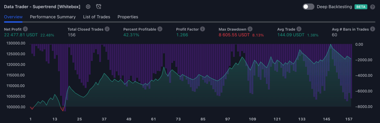
Overview tab
The Overview tab displays some of the most important metrics of strategy's performance, and also a graph showing how the equity grew (or shrunk) over time.
Key metrics
On the example report above we can see the following information:
- The data is being shown for the
Data Trader - Supertrend strategy(if you had multiple strategies applied to your chart, this would be a dropdown where you could select the strategy you wanted to view the results for). - The
Net Profitis47,089.59 USDT- this is the amount of money the strategy made. - The
Total Closed Tradesis157, which means the strategy opened and closed this many positions. We don't know, however, if these are only long trades, or short trades, or a combination of them. This information is only available on thePerformance Summarytab. - The
Percent Profitableis42.68%, which means the strategy had a winning outcome42.68%of the time. It is calculated by dividing the number of winners by the number of total trades:(67 / 157) * 100 = 42.68%. This number does not have to be above50%for the strategy to be profitable. The percent profitable alone does not tell us whether a strategy is profitable or not. A strategy with a 90% win rate can still lose money on the long term (from a total of 100 trades 90 are small wins, but 10 massive losses) - The
Profit Factoris1.315, which tells us the strategy was profitable during backtesting. It is calculated by dividing the gross profit by the gross loss. A profit factor greater than 1 indicates a profitable system; a profit factor less than 1 indicates a non-profitable system. - The
Max Drawdownis21,991.17 USDT, which displays the greatest loss drawdown, i.e. the greatest possible loss the strategy had during its run compared to its highest profits. For more information please see the "Max Drawdown" section on https://www.tradingview.com/support/solutions/43000561856-how-are-strategy-tester-report-values-calculated-and-what-do-they-mean/ - The
Avg. Tradeis299.93 USDT, which shows us how much money on average the strategy made or lost on each trade. It is calculated by dividing the net profit by the total number of trades. - The
Avg # Bars in Tradesis62, which tells us how many bars each trade lasted on average.
Please be aware that some important metrics, such as the Commission paid is not shown on the Overview tab, so we have no idea whether these results include commission. To find out how much commission the strategy paid, you have to switch over to the Performance Summary tab. By default our strategy scripts have their commission set to zero. Given that every exchange specifies its own commission fees, it wouldn't make sense for us to specify a default commission value. However, it is very important that you set a commission yourself, otherwise you may be thinking you find something that is profitable, yet with commission added it is a losing system.
Also note that you can't see how long it took for the 157 trades to be completed. If the strategy is on a 5-minutes chart, the 157 trades will usually go back at most a few weeks. Whereas if it is a 4 hours or daily chart, the 157 trades will likely go back years.
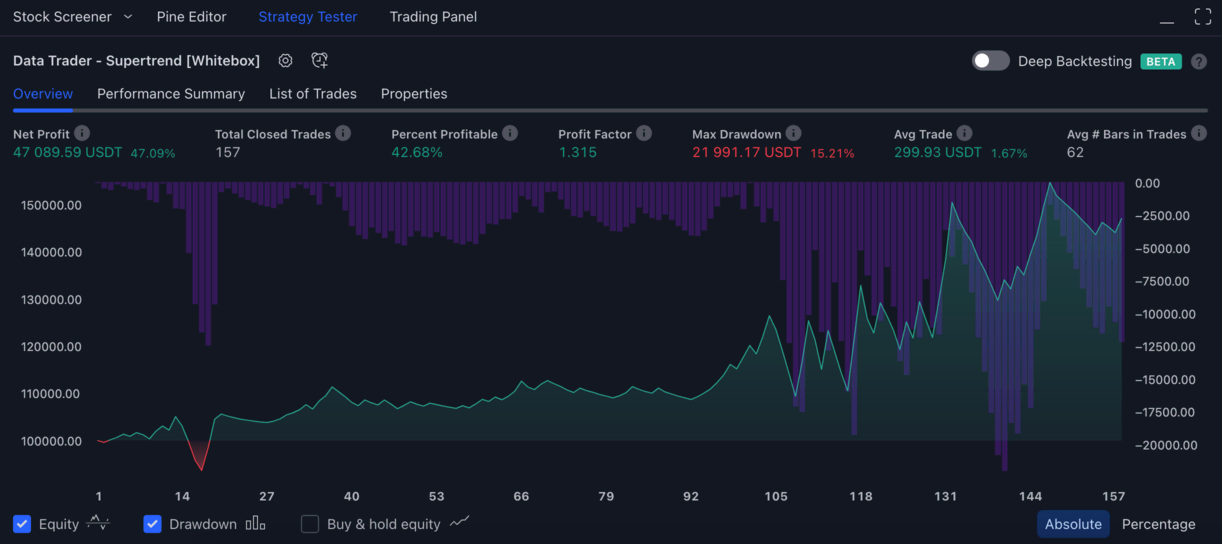
Graph
The graph on the Overview tab plots the equity and the drawdown over time.
Shown on the left y-axis is the equity, on the right y-axis it is the drawdown, and on the x-axis is the number of trades.
If you look at the leftmost index in the graph, you can see that it all started out at 100,000.00 USDT - this is the initial capital of the strategy. This is how much money the strategy was given to start trading with. The initial capital can be set on the Strategy Settings / Properties tab.
As the strategy started trading, for the first few trades the equity started to increase gradually. Soon however, the first losses appeared. Trades 13, 14, 15, 16 were losing trades, which resulted in the equity dropping below 94,000 USDT. Before the 4 losses the strategy was at around +5,000 USDT in profit. The 4 losses amounted to around -11,000 USDT, resulting in the equity falling from around 105,000 USDT to 93,000 USDT. This 12,000 USDT difference is how TradingView illustrates drawdown on the graph using the purple vertical bars.
If you would like to seek to a particular trade on the chart, just hover your mouse over the graph and click on a trade of your choice. The chart will scroll back in time to the trade you selected.
Performance Summary tab
The Performance Summary tab shows a detailed breakdown of the strategy's performance.
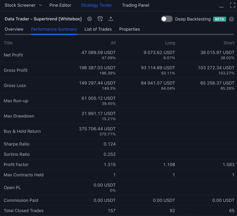
It wouldn't make sense for us to go over each of these metrics, so for further information on what each value mean, please refer to the following TradingView article:
List of Trades tab
The List of Trades tab shows detailed information about each filled entry and exit orders.
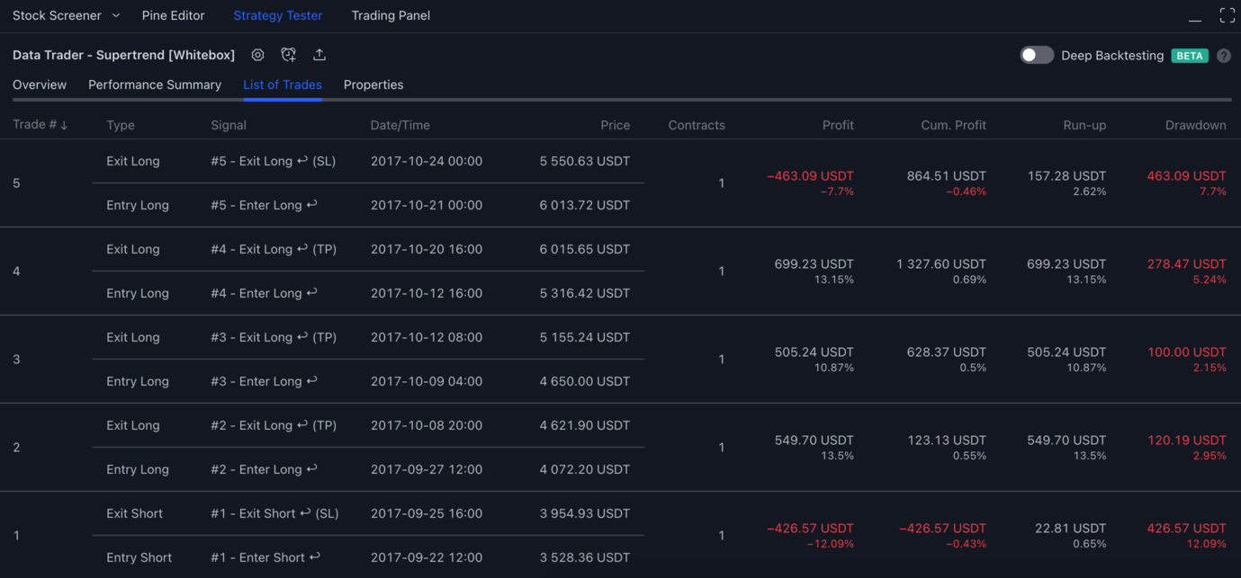
While the title says List of Trades, it is really a list of associated entry and exit orders.
By default the list is sorted in reverse chronological order, meaning that if you would like to see the first trades, you will have to scroll to the bottom. The ordering can be changed by clicking on the column headers.
If you want to inspect a particular trade on the chart, just click on the entry / exit order in the list, and the chart will automatically scroll back in time to show that trade.
On the image above we scrolled to the bottom of the list to reveal the first 5 trades.
Let's look at Trade #1, starting with the bottom (entry) order:
- The
TypeisEntry Short, which tells us it was a short entry order - The
Signalis#1 - Enter Short ↩. What is shown in theSignalcolumn is up to the scripts. Let's go through the various parts of the signal. First there is this number:#1, this is the so calledTrade counter. This is something we've come up with, so you won't find it being mentioned anywhere in the TradingView docs. The reason we created our own trade counter, is because once a trade consists of more than just a single entry / exit, it quickly gets confusing what orders make up a particular trade. More on this below. Next, there is description of the orderEnter Short, this let's you know it is a short entry. Finally, there is this symbol:↩(a backward arrow), which indicates that the strategy backtested this particular trade. For forward-tested trades the strategy would display↪. (The script forward-tests a trade when the trade occurs on realtime candles, while your browser window is open). - The
Date/Timeis2017-09-22 12:00, which is the opening time of the candle on which the strategy's entry order was filled - The
Priceis3,528.36 USDT- this is the price the entry order was filled at. In other words, this is the entry price - The
Contractsis1, which means the strategy shorted1BTCvia the entry order
Now we have an open short position, but which was the exit order which eventually led to the closure of this short position?
The exit order can be found right above each entry order. TradingView is quite helpful here by bundling each entry and exit order in the list.
Let's look at the exit order now:
- The
TypeisExit Short, which tells us it was a short exit order - The
Signalis#1 - Exit Short ↩ (SL). Again, let's go through each component in the signal.#1is the trade counter, which tells us this exit order is part of trade1. Next we haveExit Short, which is the description of the exit order. Finally we have↩and(SL).↩tells us that the strategy backtested this particular trade, and(SL)indicates that the position was exited because the Stop Loss was hit. - The
Date/Timeis2017-09-25 16:00, which is the opening time of the candle on which the strategy's exit order was filled. It is important to note here that when a strategy is being backtested, TradingView has no accurate data that could tell us when exactly during that candle the exit price was hit. All TradingView can tell us is that the price was hit during that candle. - The
Priceis3,954.93 USDT- this is the price the exit order was filled at. In other words, this is the exit price.
Finally let's look at outcome of the trade:
Profitshows-426.57 USDT(-12.09%) - this tells us that this trade was a loss resulting in a loss of-426.57 USDTCumulative Profitshows the sum of all previous trades profit. Given that we are on the first trade, the cumulative profit is the same as the profit of the current trade.Run-upshows how much profit the trade would have generated, had it been closed at the most favourable price (22.81 USDT)Drawdownshows how much loss the trade would have generated, had it been closed the least favourable price. It is the exact same value as our exit price. The trade couldn't have been closed at a worse price where it exited.
Trade counter explained
Alright, so what is the deal with the trade counter in the Signal? Why do we need to associate trades with a second number besides the identifier TradingView already provides in the first column of the List of Trades tab?
First of all, as mentioned above, the trade counter is a completely bespoke feature of our strategies, you probably won't find it in any other strategies. It is only a visual feature, so it doesn't affect the trades in any way. Please read on if you would like to learn more about why it is used. Otherwise, feel free to skip to the next section.
To understand why we decided to tag entry and exit orders with an additional number, let's look at the difference between a trade that consists only a single entry and exit order, and a trade that consists of multiple entry and exit orders.
Trade with single entry/exit order
As we have seen from the example trade above (#1), when a trade consists of only a single entry and a single exit order, its quite easy to understand what orders make up a particular trade. TradingView displays each trade and its orders in an intuitive manner, with each trade being separated by line.
Just to make it extremely clear, we've drawn a box around each trade:
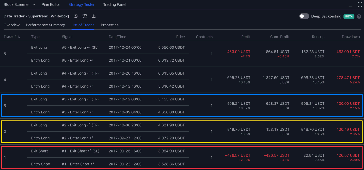
- Trade #1 which consists of a single entry and a single exit order is marked with red
- Trade #2 which consists of a single entry and a single exit order is marked with yellow
- Trade #3 which consists of a single entry and a single exit order is marked with blue
- etc.
Nothing to be confused about here. Now let's look at some trades that is made up of multiple entry and exit orders.
Trade with multiple entry/exit orders
First of all, how to make the strategy use multiple entry orders per trade? Currently, the only way to achieve this is by using DCA orders.
Once you turn on DCA, the list of trades tab will show you each entry/exit order pairs separately, without giving you much of a clue which orders are part of which trade.
For the sake of demonstrating the importance of the trade counter, on the first screenshot we have hidden the signal column:
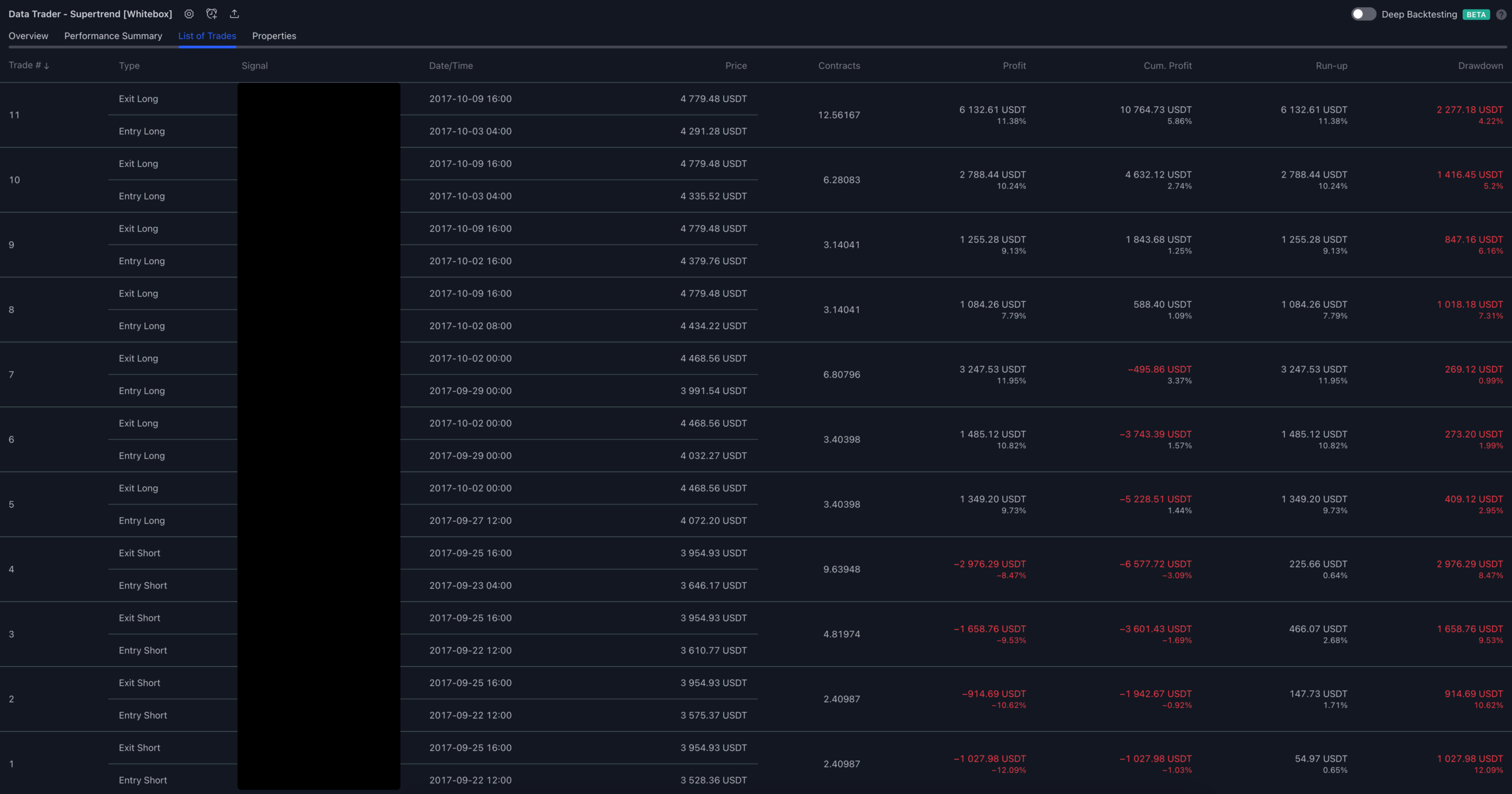
Looking at this image you would think there were 11 individual trades, each trade consisting of a single entry and exit order.
Now let's look at the same image with the signals shown, and boxes drawn around related sections:
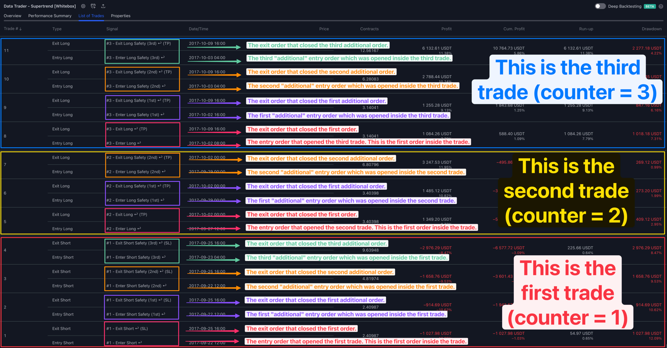
While the image may look "somewhat" confusing with all the boxes and lines drawn all over it, it should help you to see how the #1, #2 and #3 trade counter shown in the Signal column is the only thing that tell you that the seemingly unrelated entry/exit order pairs are in fact making up 3 trades in total.
- The outer red box is drawn around trade 1 (this trade consists of 4 orders:
1,2,3,4) - The outer yellow box is drawn around trade 2 (this trade consists of 3 orders:
5,6,7) - The outer blue box is drawn around trade 3 (this trade consists of 4 orders:
8,9,10,11)
Each of these trades consist of multiple entry/exit order pairs, these are boxed individually:
- The first entry/exit order pair is pink
- The second entry/exit order pair is purple
- The third entry/exit order pair is orange
- The fourth entry/exit order pair is green(ish)
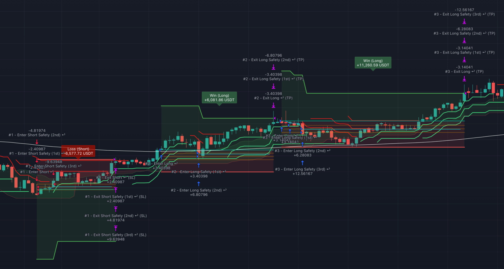
Here are the 3 trades as they appear on the chart:
Properties tab
The Properties tab displays the following information:
- Date range
- Trading range: This shows the date range of the first entry and the time of the last available bar (i.e. if the first entry was at
2017-09-17 12:00:00and the last available bar on the chart is2022-11-11 08:00:00the trading range will be2017-09-17 12:00:00 - 2022-11-11 08:00:00) - Backtesting range: This shows the date range of the first and the last available bars (i.e. if the first bar was at
2017-08-01 04:00:00and the last available bar on the chart is2022-11-11 08:00:00the trading range will be2017-08-01 04:00:00 - 2022-11-11 08:00:00)
- Trading range: This shows the date range of the first entry and the time of the last available bar (i.e. if the first entry was at
- Symbol info
- Symbol: The chart's symbol, that is made up of the exchange and a colon separating the market
- Timeframe: The timeframe of the chart
- Chart type: The chart's type (possible values: Bars, Candles, Hollow candles, Columns, Line, Area, Baseline, High-low, Heikin Ashi, Renko, Line break, Kagi, Point & figure, Range). Please note that non-standard charts (i.e. Heikin Ashi, Renko, etc. are not supported by the strategies)
- Point value: The point value is the multiple of the underlying asset determining a contract’s value. On "ES1!" ("S&P 500 E-Mini") the point value is 50, so a contract is worth 50 times the price of the instrument
- Currency: The quote currency, e.g.,
USDinBTCUSD, orCADinUSDCAD - Tick size: The symbol's tick value, or the minimum increment price can move in. Not to be confused with pips or points. On
ES1!("S&P 500 E-Mini") the tick size is 0.25 because that is the minimal increment the price moves in.
- Strategy inputs: This is the list of all strategy settings from the
Inputstab - Strategy properties: This is the list of all strategy settings from the
Propertiestab. More information about thePropertiestab can be found here
Deep Backtesting
Deep Backtesting is an additional mode of operation of the Strategy Tester, which makes it possible to calculate the strategy on all historical data available for the selected symbol, and not only on those loaded on the chart.
Deep Backtesting is only available to Premium TradingView subscribers.
For more information please see:
- https://www.tradingview.com/blog/en/deep-backtesting-beta-32733/
- https://www.tradingview.com/support/solutions/43000666199-what-is-deep-backtesting/
Trades on chart
TradingView by default displays the trades on the chart.
To turn this information on/off, open the strategy settings window, switch to the Style tab, and scroll down to the following section:
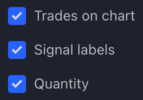
Please note that the Win/Loss labels and the red/green area showing the stop loss and take profit is drawn by the strategy script and is not a build-in feature of TradingView. To turn these on/off please see the Appearance settings of the Inputs tab. More info here
Let's take a look at a short and a long trade and see how these appear on the chart.
Short trade
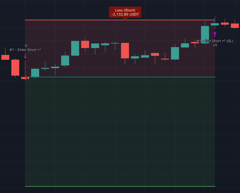
The strategy signalled an entry on the close of the 2nd candle, resulting in the short position to be entered on the next candle open (3rd candle).
The red triangle is pointing at the exact price level at which the short entry order was filled. This will be the candle's open price.
The Signal of the entry is then printed above the entry bar, alongisde the quantity that was sold (-5). You should be able to bring up the Strategy Tester's List of Trades tab, scroll to trade #1 and confirm the entry price and the quantity being the same.
The price ended up going against the trade, and on the 3rd candle from the right the stop loss was hit. A purple triangle is pointing at the exact price level at which the position was closed.
The Signal of the exit is printed above the exit bar, alongside the quantity that was bought (+5).
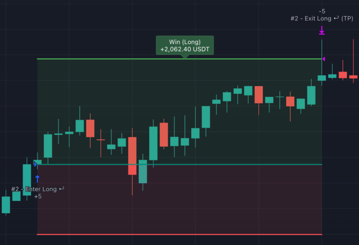
Long trade
The same applies to a long trade, the only difference is that on entry the strategy buys (hence the quantity is positive), and on exit the strategy sells (hence the quantity is negative).